Project
Overview
Hello Nori is a hand roll bar in Vancouver. Across one engagement I produced three tiers of media for the brand — photoreal 3D renders of their house sake for the restaurant’s digital screens, a conversion-driven Instagram campaign, and a six-second promotional video cut to music. Different disciplines, one voice.
(01)
3D product renders
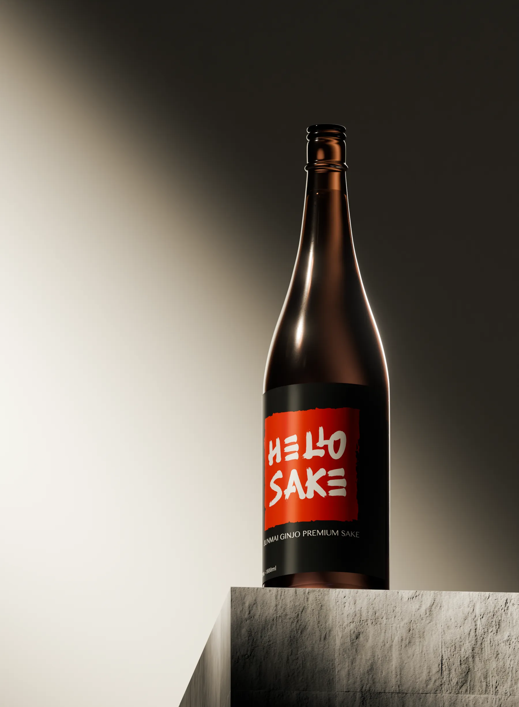
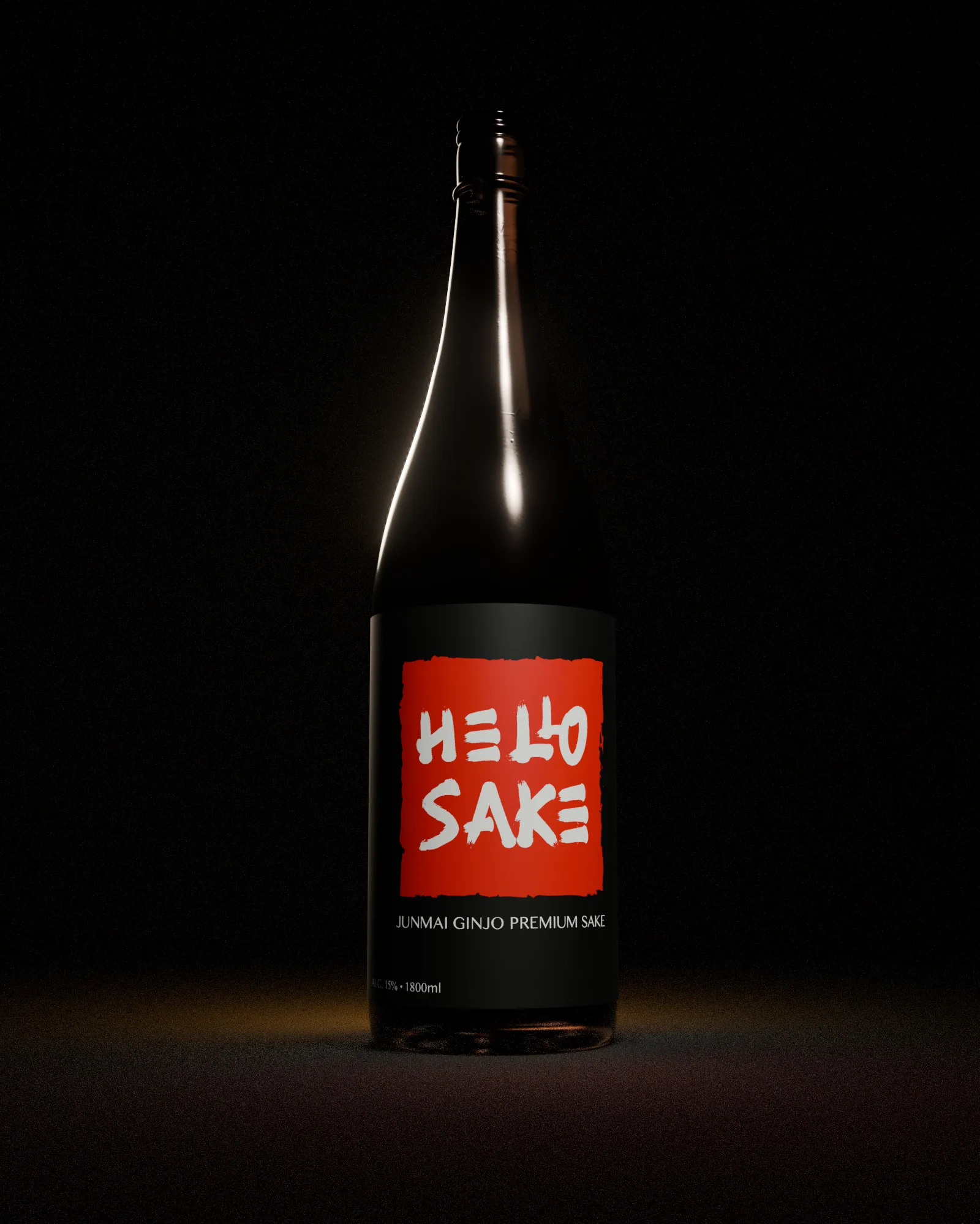
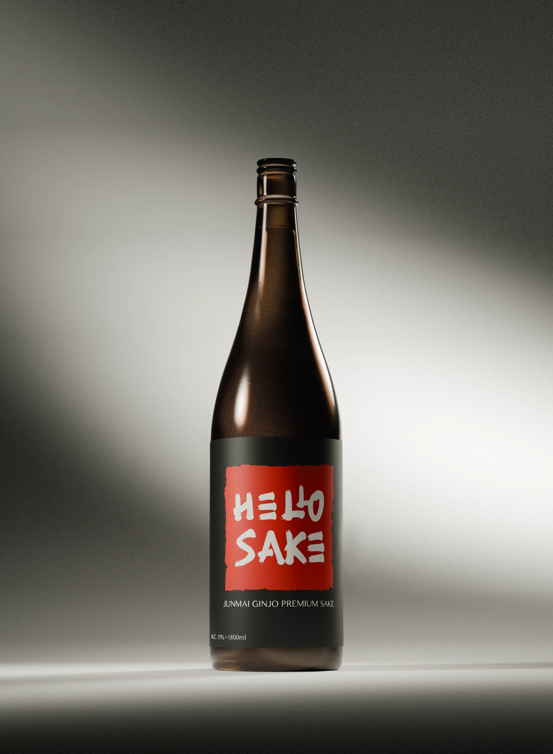
The brief was premium promotional media for the digital screens inside Hello Nori — imagery polished enough to hang beside the food. Rather than book a product shoot, I rebuilt the bottle as a photoreal digital asset: something the brand can relight, reframe and reuse for any future campaign. The goal was never just to recreate a bottle; it was to produce finished marketing assets suitable for a restaurant environment.
01
Photographed the real house sake bottle, alongside reference photography supplied by Hello Nori.
02
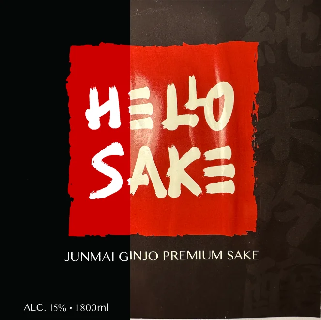
Carefully removed the label, shot it flat, and rebuilt it as a clean vector texture in Illustrator.
03
Modelled and sculpted the bottle in Blender against the reference until the silhouette matched.
04
Dressed the glass in real-world imperfections — faint scratches and surface noise, so it reads as an object rather than a render.
05
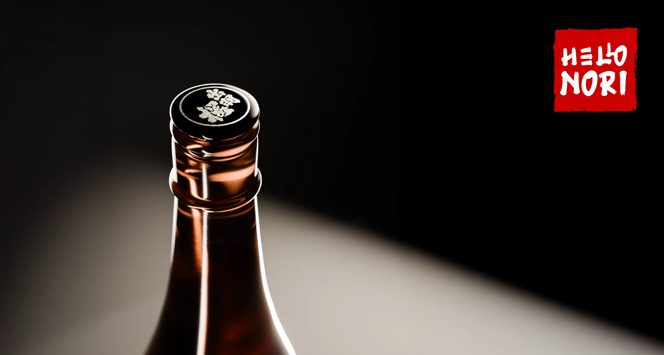
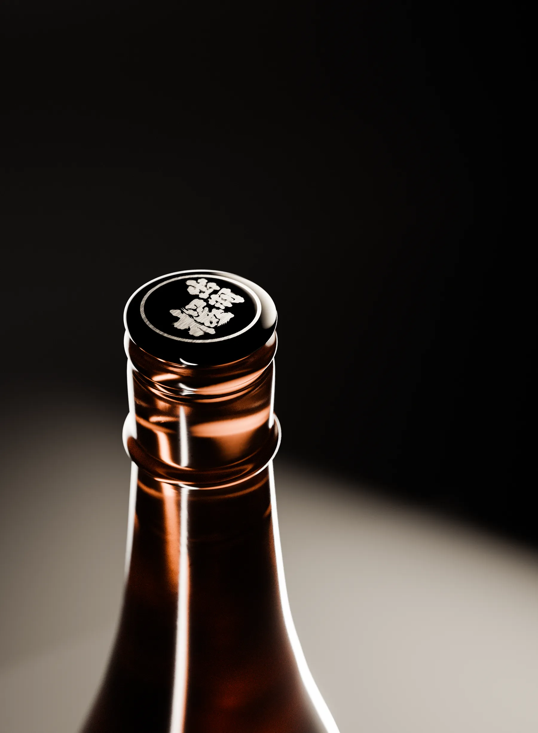
Reproduced the cap's painted lettering as actual metallic material instead of a flat texture.
06
Ran lighting experiments until several finished compositions with different moods survived the cut.
One asset, any mood
Because the bottle is a digital twin rather than a photograph, lighting is a decision instead of a constraint. The same model runs from low-key and dramatic to soft studio grey — whatever the campaign calls for.
The label came off the bottle
The original label was removed from the physical bottle, photographed flat, and rebuilt as a clean vector texture in Illustrator — glare, washi grain and all the print detail preserved, without the distortion of shooting it on glass.
The cap is the tell
The lettering on the cap is metallic paint on the real bottle, so it's metallic material in the render — not a flat decal. It's a small detail, but it's exactly where photorealism usually falls apart under a close crop. This is the frame to zoom into.
Built for the room
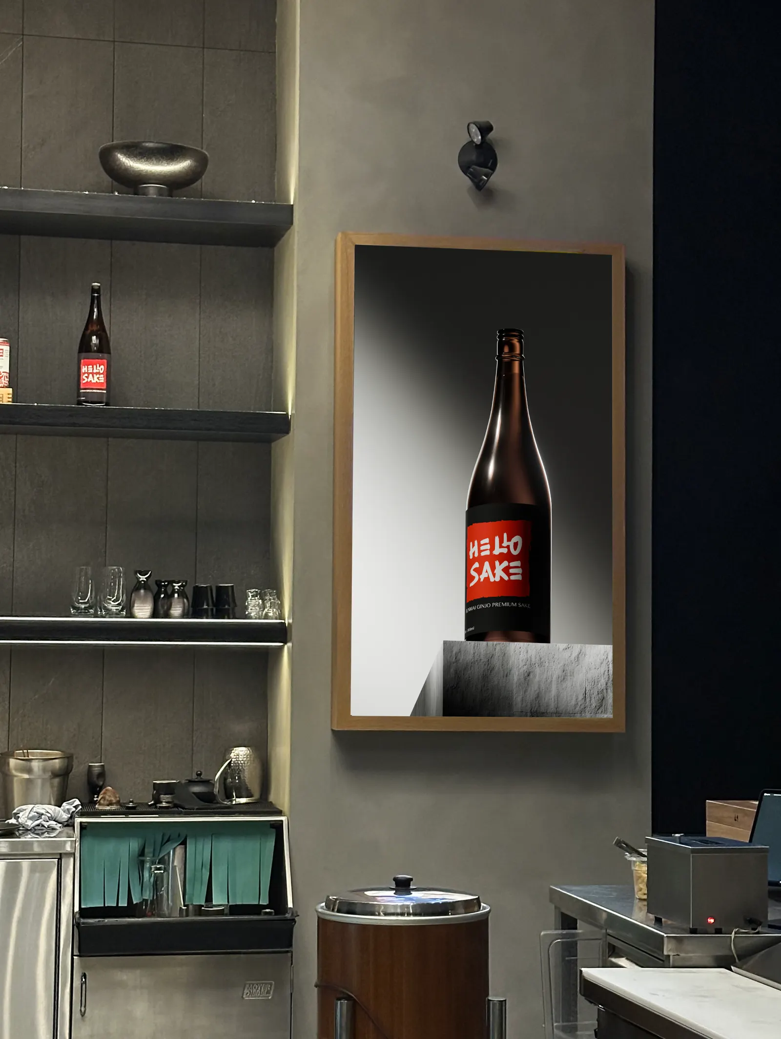
The renders were made for a place, not a portfolio — framed screens on the restaurant wall, seen from a bar seat. In context, the work has to read instantly and still hold up when someone looks twice.
(02)
Instagram statics
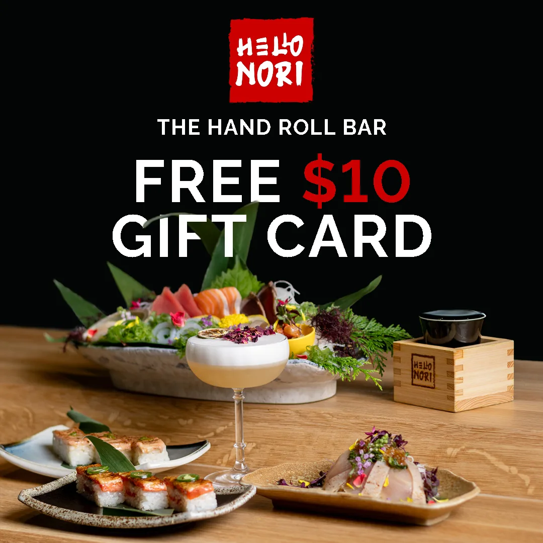
A straightforward conversion play: a free $10 gift card in exchange for joining the Hello Nori mailing list. The objective was signups, not awareness — so the offer leads and everything else supports it. I combined photography supplied by Hello Nori with typography, layout and promotional messaging. Each design shipped in feed and story dimensions; one representative crop of each is shown here.
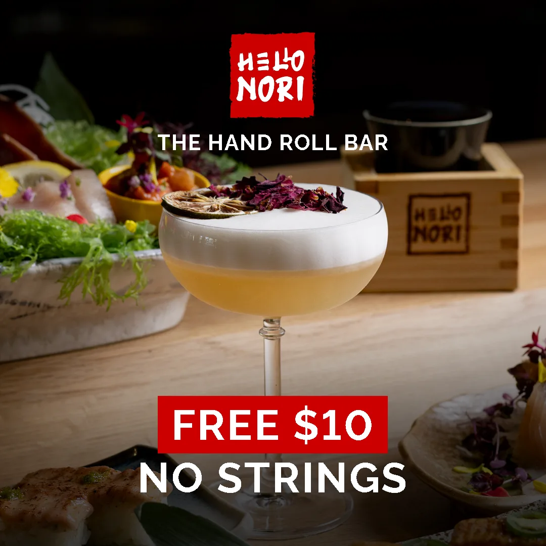
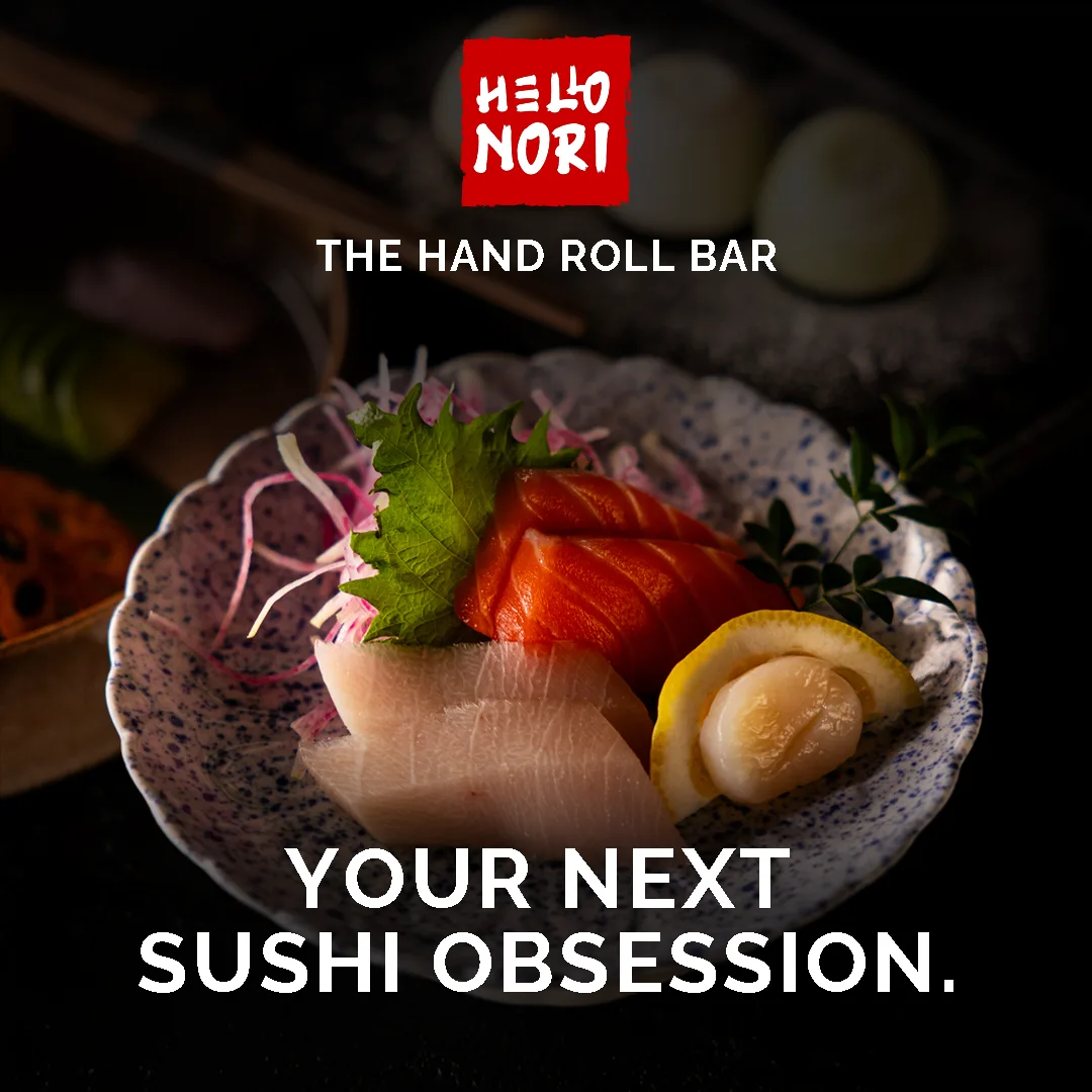
The last deliverable argues a point: sound is half the picture.
(03)
The six-second ad
Hello Nori's videographer supplied the raw footage; my job was a five-to-seven-second cut for the same gift-card campaign. I chose the music, set the pacing, made the cuts, synced the visuals to the track, built the typography and motion graphics, and layered in the sound effects. The soundtrack is 'Places To Be' by Fred again.. — its tempo suits short-form, and the opening vocal ('hello, hello, hello') hands the brand its own introduction.
(Interactive)
Flip the sound design off. Then back on.
Same footage, same track, same cut — the only thing that changes is the effects layer. You’ll hear it inside a second: the whooshes carry the camera moves, and without them the edit goes flat.
A few pieces of the layer, isolated:
One bottle, one offer, six seconds — three different disciplines carrying the same brand voice.
Next project
COOCIO