Project
Overview
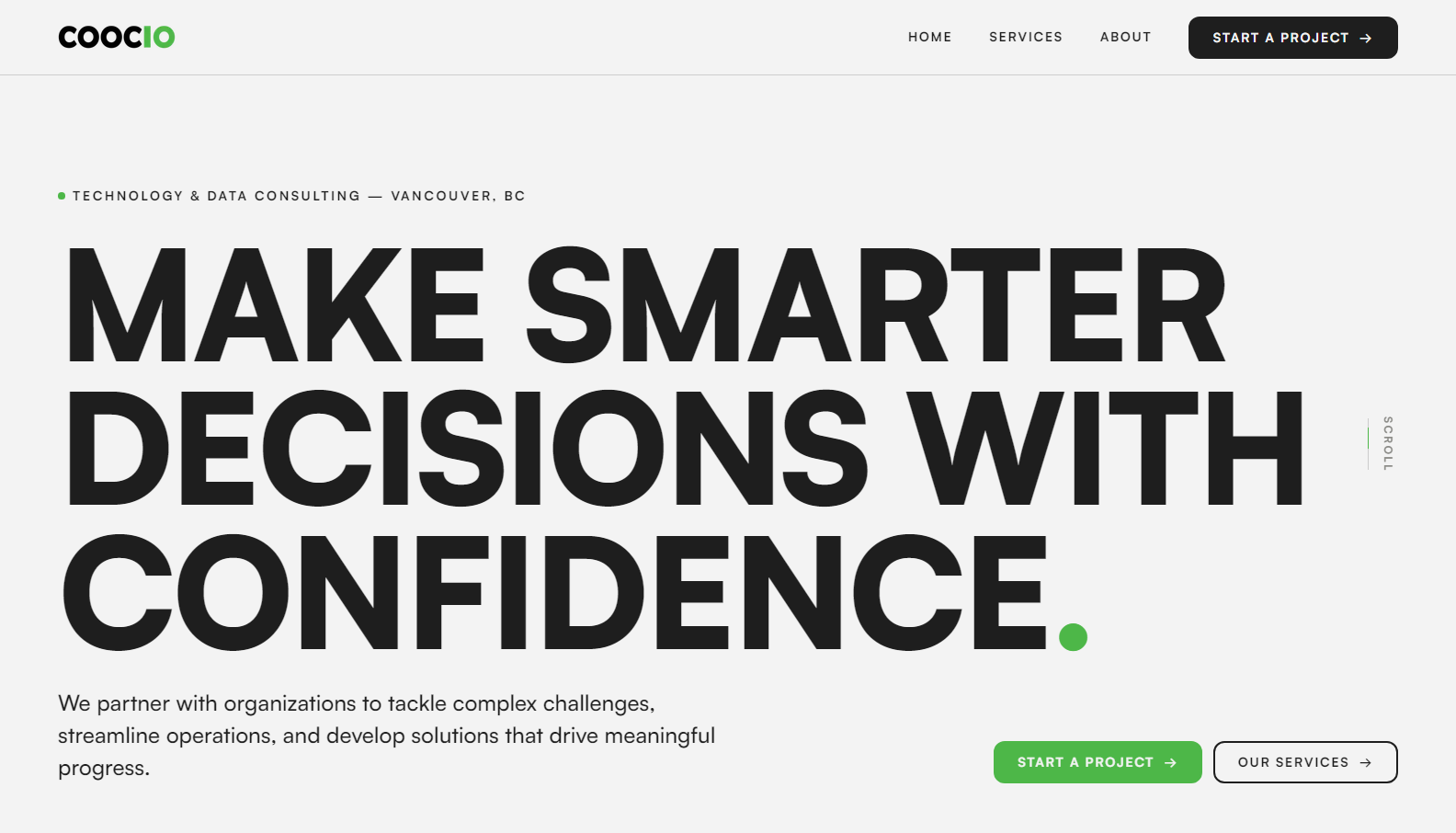
COOCIO is a technology and data consulting firm in Vancouver whose website undersold the quality of its work. I redesigned and rebuilt it end to end — broader positioning, a new identity, and a custom-coded site that replaced their templated Wix subscription with something they own outright.
(01)
The problem
The old Wix site looked templated and dated, leaned on stock photography, and framed the firm too narrowly — 'real estate technology advice' — when their expertise actually spans strategy, operations, data and AI. The content was dense and hard to skim, and the platform charged a recurring fee for e-commerce features a consultancy selling nothing online has no use for. The brief was a balancing act: the client wanted something cool, unique and modern that felt like them, but the site's real job is to explain what they do and show they can be trusted to do it.
(02)
A site they own, not one they rent
Rather than pay for a platform built around features they'd never use, the new site is designed and built from scratch and hosted on Vercel. That removes the recurring platform cost entirely and leaves COOCIO with a fast, ownable site instead of a rented template.
(03)
A clearer story
Before touching the visuals, the positioning was broadened from the narrow real-estate framing to the full technology-and-data offering, organized into five numbered service pillars. Numbering them turns a list into a system — it signals the structured, methodical thinking a consultancy is actually selling.
A firm whose whole pitch is making complexity simple can’t greet you with a cluttered interface.
(04)
An outlier in a blue industry
Consulting brands default to navy. COOCIO's accent is green — it reads as growth and forward motion rather than institutional caution, matching their language of meaningful progress. It's used sparingly, only on key emphasis and interactive elements against a black and off-white base, so the accent always means 'this matters — look here.'
(05)
Confidence you can feel
The copy promises confidence, so the type had to feel certain rather than tentative — bold, large display headings anchor every section. The generous whitespace is strategic too: each idea gets room to land one at a time.
(06)
Motion with a purpose
Headings reveal as you scroll, staging information in the intended reading order, and pages flow into one another as a single continuous surface instead of disconnected loads. The movement delivers the 'cool and unique' the client asked for without ever distracting from the message.
COOCIO now has a site that matches the caliber of their work — a clearer story, an identity apart from an industry of blue, and a fast custom site they own outright.
Next project
Decked Beer